SlideShare a Scribd company logo
1 of 2
Download to read offline
Digital Marketing Brief 
Publishers Field Guide to Mobile- 
Optimized Messaging 
Download the Full Guide 
Consumer adoption of mobile devices has taken off with astonishing speed 
– and publishers now find that more than a third of their audience accesses 
content via mobile. The move to mobile devices is having a significant impact 
on subscriber engagement. The ways that audiences interact with content 
have changed. 
As ubiquitous as mobile usage is now – with current estimates at 4.55 billion 
users worldwide – mobile subscriptions are predicted to reach 8 billion in 
2016. Mobile users interact with brands wherever, whenever, and however 
they want – and expect a seamless experience doing it. Whether cell phones, 
smartphones, tablets, or apps – it’s clear that the time to optimize for 
mobile is now.
Copyright © 2014 Lyris, Inc. All rights reserved. lyris.com 
About Lyris Inc: 
With more than 20 years’ experience, Lyris is a global leader of innovative email and digital marketing solutions that 
help companies reach audiences at scale and create personalized value at every touch point. Lyris’ products and 
services empower publishers to design, automate, and optimize experiences that facilitate superior engagement, 
increase conversions, and deliver measurable business value. The Lyris solutions portfolio is uniquely comprised 
of award- winning messaging automation software, digital marketing strategy and deliverability services, and 
a componentized and flexible integration framework that revolutionizes the way marketers can extend digital 
messaging across the enterprise. More than 5,000 companies worldwide partner with Lyris to manage connected 
customer communications. 
Learn more at www.lyris.com. 
Three Mobile Optimization Options 
1. Fluid Email Layout – means that the email width expands or contracts depending on the size of the viewing 
screen. This straightforward approach to mobile optimization is easy to execute: set the width of your email to a 
percentage rather than having a fixed width. This way, the email effectively flows across whatever screen it is 
viewed on. 
2. Scalable Design – features a single ‘mobile-friendly’ email layout that looks good on small and large screens. 
Unique features of this approach include: 
• A single-column layout which is relatively narrow compared to most other emails 
• Large titles 
• Large calls-to-action which are easy to click on mobile devices 
• A good amount of white space 
• A small amount of body copy which can easily be read at a glance 
3. Responsive Design – allows you to change the way your email looks or is displayed depending on the size of the 
viewer’s screen. It gives you an enormous amount of flexibility to add, remove, or re-arrange the content of your 
email so that your subscribers will have the very best experience, no matter what device or email client they read 
your email on. Responsive design is by far the best mobile optimization option. 
Download the full guide to learn more about responsive design and steps for implementing a mobile 
optimization strategy. 
Download the Full Guide

More Related Content

Viewers also liked

resume_final04
resume_final04resume_final04
resume_final04Theresa Yu
 
Java debugging tools
Java debugging toolsJava debugging tools
Java debugging toolsAman Ahmed
 
Compañías de envíos de carga
Compañías de envíos de cargaCompañías de envíos de carga
Compañías de envíos de cargaZrtha Marhiana
 
Análisis de las páginas web
Análisis de las páginas webAnálisis de las páginas web
Análisis de las páginas webGabriel Ley
 
FINAL Training Facilitator Guide (2)
FINAL Training Facilitator Guide (2)FINAL Training Facilitator Guide (2)
FINAL Training Facilitator Guide (2)David Keyser
 
Educational Attainment in the Hispanic and Latino Population in San Jose_fina...
Educational Attainment in the Hispanic and Latino Population in San Jose_fina...Educational Attainment in the Hispanic and Latino Population in San Jose_fina...
Educational Attainment in the Hispanic and Latino Population in San Jose_fina...Theresa Yu
 

Viewers also liked (9)

Video door phone information
Video door phone informationVideo door phone information
Video door phone information
 
resume_final04
resume_final04resume_final04
resume_final04
 
Java debugging tools
Java debugging toolsJava debugging tools
Java debugging tools
 
Circuits
CircuitsCircuits
Circuits
 
Compañías de envíos de carga
Compañías de envíos de cargaCompañías de envíos de carga
Compañías de envíos de carga
 
Análisis de las páginas web
Análisis de las páginas webAnálisis de las páginas web
Análisis de las páginas web
 
FINAL Training Facilitator Guide (2)
FINAL Training Facilitator Guide (2)FINAL Training Facilitator Guide (2)
FINAL Training Facilitator Guide (2)
 
Educational Attainment in the Hispanic and Latino Population in San Jose_fina...
Educational Attainment in the Hispanic and Latino Population in San Jose_fina...Educational Attainment in the Hispanic and Latino Population in San Jose_fina...
Educational Attainment in the Hispanic and Latino Population in San Jose_fina...
 
fiona_cv_updated
fiona_cv_updatedfiona_cv_updated
fiona_cv_updated
 

2014 Publishers Field Guide to Mobile Optimized Messaging by Lyris

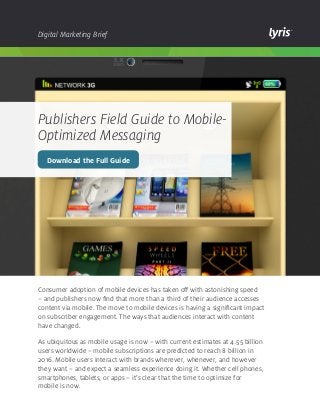
  • 1. Digital Marketing Brief Publishers Field Guide to Mobile- Optimized Messaging Download the Full Guide Consumer adoption of mobile devices has taken off with astonishing speed – and publishers now find that more than a third of their audience accesses content via mobile. The move to mobile devices is having a significant impact on subscriber engagement. The ways that audiences interact with content have changed. As ubiquitous as mobile usage is now – with current estimates at 4.55 billion users worldwide – mobile subscriptions are predicted to reach 8 billion in 2016. Mobile users interact with brands wherever, whenever, and however they want – and expect a seamless experience doing it. Whether cell phones, smartphones, tablets, or apps – it’s clear that the time to optimize for mobile is now.
  • 2. Copyright © 2014 Lyris, Inc. All rights reserved. lyris.com About Lyris Inc: With more than 20 years’ experience, Lyris is a global leader of innovative email and digital marketing solutions that help companies reach audiences at scale and create personalized value at every touch point. Lyris’ products and services empower publishers to design, automate, and optimize experiences that facilitate superior engagement, increase conversions, and deliver measurable business value. The Lyris solutions portfolio is uniquely comprised of award- winning messaging automation software, digital marketing strategy and deliverability services, and a componentized and flexible integration framework that revolutionizes the way marketers can extend digital messaging across the enterprise. More than 5,000 companies worldwide partner with Lyris to manage connected customer communications. Learn more at www.lyris.com. Three Mobile Optimization Options 1. Fluid Email Layout – means that the email width expands or contracts depending on the size of the viewing screen. This straightforward approach to mobile optimization is easy to execute: set the width of your email to a percentage rather than having a fixed width. This way, the email effectively flows across whatever screen it is viewed on. 2. Scalable Design – features a single ‘mobile-friendly’ email layout that looks good on small and large screens. Unique features of this approach include: • A single-column layout which is relatively narrow compared to most other emails • Large titles • Large calls-to-action which are easy to click on mobile devices • A good amount of white space • A small amount of body copy which can easily be read at a glance 3. Responsive Design – allows you to change the way your email looks or is displayed depending on the size of the viewer’s screen. It gives you an enormous amount of flexibility to add, remove, or re-arrange the content of your email so that your subscribers will have the very best experience, no matter what device or email client they read your email on. Responsive design is by far the best mobile optimization option. Download the full guide to learn more about responsive design and steps for implementing a mobile optimization strategy. Download the Full Guide